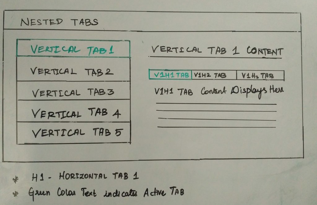
In this blog post, I will showcase a simple example that implements vertical nested tabs for content navigation using CSS3, HTML5 and jQuery.
HTML5 takes care of the Nested Tab Structure, CSS3 handles the look and feel and jQuery the tab functionality.
Basic Building Blocks
- Create a HTML5 page structure and then frame the Nested Tab structure using HTML5.
- Include the required jQuery library and easyResponsiveTab js in before closing the body tag.
- Include the easy-responsive-tabs.css in the top of the web page inside the head tag. We can adjust the breakpoints, according to our web content.
- Finally, Initialize the jQuery with the following options.
<script src="//ajax.googleapis.com/ajax/libs/jquery/1.11.2/jquery.min.js"></script>
<script src="easy-responsive-tabs.js"></script>
<link rel="stylesheet" href="easy-responsive-tabs.css">
$('#ChildVerticalTab_1').easyResponsiveTabs({ //Initialize the Plugin
      type: 'vertical',
      width: 'auto',
      fit: true,
      tabidentify: 'ver_1', // The tab groups identifier
      activetab_bg: '#fff', // background color for active tabs in this group
      inactive_bg: '#F5F5F5', // background color for inactive tabs
      active_border_color: '#c1c1c1', // border color for active tabs heads
      active_content_border_color: '#5AB1D0' // border color for active tabs contect in this group so that it matches the tab head border
 });
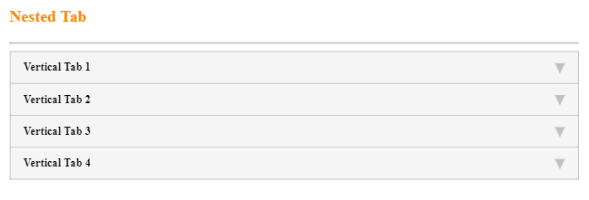
This results in a nested tab which is mobile responsive as shown below. You can further customize the look and feel of the nested tab.
Responsive Nested Tab
Sample Code
<!DOCTYPE html>
<html lang="en">
<head>
<meta http-equiv="Content-Type" content="text/html; charset=utf-8"/>
<meta name="viewport" content="width=device-width, initial-scale=1">
<title>Nested Tab Example</title>
<link rel="stylesheet" type="text/css" href="css/style.css">
<link rel="stylesheet" type="text/css" href="css/easy-responsive-tabs.css "/>
</head>
<body>
<div class="Container">
<div class="wrap">
<div class="Content">
<h3 class="section-title">Nested Tab</h3> <hr>
<!--vertical Tabs-->
<div class="verticaltab">
<div id="ChildVerticalTab_1">
<ul class="resp-tabs-list ver_1">
<li>Vertical Tab 1</li>
<li>Vertical Tab 2</li>
<li>Vertical Tab 3</li>
<li>Vertical Tab 4</li>
</ul>
<div class="resp-tabs-container ver_1">
<!-- Vertical Tab 1-->
<div>
<!--Horizontal Tab-->
<div class="verticalcat">
<h4 class="tab_title">Vertical Tab 1 Content</h4>
<input id="tab1" type="radio" name="tabs" checked>
<label for="tab1" id="new" class="horizontal_cat_list active">V1H1 Tab</label>
<input id="tab2" type="radio" name="tabs">
<label for="tab2" class="horizontal_cat_list">V1H2 Tab</label>
<section id="content1">
<div class="pagination-container">
<div data-page="1">
<div class="row">
<div class="col-md-12">V1H1 - Lorem Ipsum is simply dummy text of the printing and typesetting industry.</div>
</div>
</div>
</div>
</section>
<section id="content2">
<div class="pagination-container">
<div data-page="1">
<div class="row">
<div class="col-md-12">V1H2 - Lorem Ipsum has been the industry's standard dummy text ever since the 1500s.</div>
</div>
</div>
</div>
</section>
</div>
</div>
<!-- ##Vertical Tab 1 ## -->
<!-- Vertical Tab 2 Content-->
<div>
<!--Horizontal Tab-->
<div class="verticalcat">
<h4 class="tab_title">Vertical Tab 2 Content</h4>
<input id="tab9" type="radio" name="tabs" checked>
<label for="tab9" id="new" class="horizontal_cat_list ">V2H1</label>
<input id="tab10" type="radio" name="tabs">
<label for="tab10" class="horizontal_cat_list">V2H2</label>
<section id="content9">
<div class="pagination-container">
<div data-page="1">
<div class="row">
<div class="col-md-12">V2H1 - Lorem Ipsum has been the industry's standard dummy text ever since the 1500s.</div>
</div>
</div>
</div>
</section>
<section id="content10">
<div class="pagination-container">
<div data-page="1">
<div class="row">
<div class="col-md-12">V2H2 - Lorem Ipsum has been the industry's standard dummy text ever since the 1500s.</div>
</div>
</div>
</div>
</section>
</div>
</div>
<!-- ## Vertical Tab 2 Content##-->
<!-- Vertical Tab 3 Content -->
<div>
<!--Horizontal Tab-->
<div class="verticalcat">
<h4 class="tab_title">Vertical Tab 3 Content</h4>
<input id="tab17" type="radio" name="tabs" checked>
<label for="tab17" id="new" class="horizontal_cat_list ">V3H1</label>
<input id="tab18" type="radio" name="tabs">
<label for="tab18" class="horizontal_cat_list">V3H2</label>
<section id="content17">
<div class="pagination-container">
<div data-page="1">
<div class="row">
<div class="col-md-12">V3H1 Content</div>
</div>
</div>
</div>
</section>
<section id="content18">
<div class="pagination-container">
<div data-page="1">
<div class="row">
<div class="col-md-12">V3H2 Content</div>
</div>
</div>
</div>
</section>
</div>
</div>
<!-- ##Vertical Tab 3 Content## -->
<!-- Vertical Tab 4 Content -->
<div>
<!--Horizontal Tab-->
<div class="verticalcat">
<h4 class="tab_title">Vertical Tab 4 Content</h4>
<input id="tab25" type="radio" name="tabs" checked>
<label for="tab25" id="new" class="horizontal_cat_list ">V4H1</label>
<input id="tab26" type="radio" name="tabs">
<label for="tab26" class="horizontal_cat_list">V4H2</label>
<section id="content25">
<div class="pagination-container">
<div data-page="1">
<div class="row">
<div class="col-md-12">V4H1 Content</div>
</div>
</div>
</div>
</section>
<section id="content26">
<div class="pagination-container">
<div data-page="1">
<div class="row">
<div class="col-md-12">V4H2 Content</div>
</div>
</div>
</div>
</section>
</div>
</div>
<!-- ##Vertical Tab 4 Content## -->
</div>
</div>
</div>
</div>
</div>
</div>
<!-- Include the Scripts Here -->
<script src="js/jquery.min.js"></script>
<script src="js/jquery-1.9.1.min.js"></script>
<script src="js/easyResponsiveTabs.js"></script>
</body>
</html>